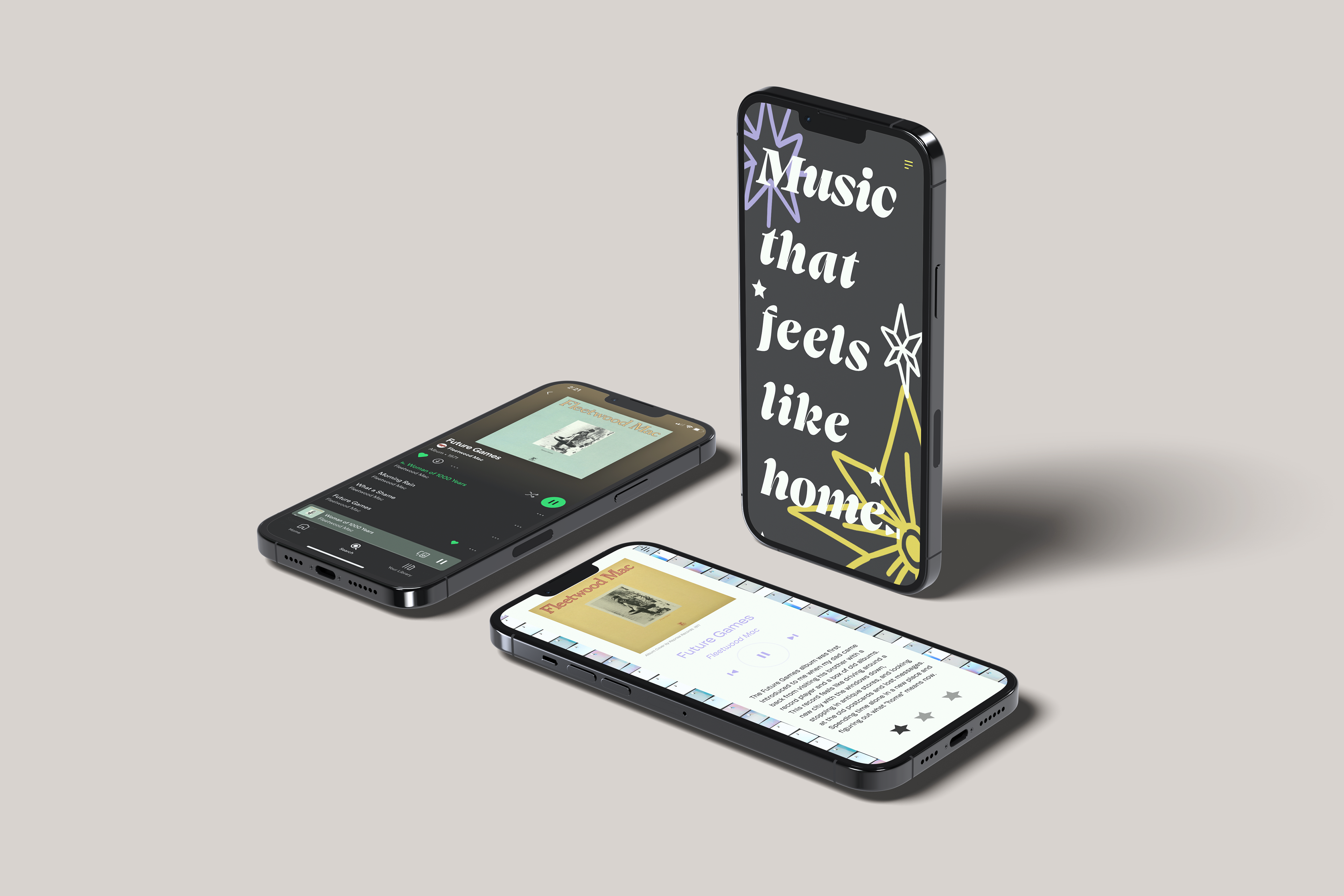
The first project of Interaction Design, “These are a Few of My Favorite Things” take the concepts of UX and UI design we’ve been introduced to in the first weeks of this semester through lectures and exercises. The goal of Project 1 is to design a one-page mobile site that is easy to navigate as well as aesthetically pleasing using Adobe XD. The first step of this project for me was to narrow down what topic I wanted to discuss through my mobile site. The first concept that came to mind was music. I thought of my favorite songs, albums, and artists. I settled on albums because I can never narrow down my favorite song or artist, that changes almost daily. Once I came up with a list of three albums: Future Games by Fleetwood Mac, You and Your Friends by Peach Pit, and Fearless (Taylors Version) by Taylor Swift, I moved onto the next steps. Because this site was one page, site mapping was a simple process. Wire framing for me however is where the things began to get complicated. I made the mistake of jumping right into XD, a software I’ve never used before. Doing this created frustration and confusion, and I lost sight of what the purpose of wire framing is. I immediately became too concerned with the aesthetics of my site instead of focusing on layout and usability. So, after having to walk away from my computer, I sketched my layout using only a pen and paper. This forced me to focus on navigation, usability, and the overall composition. I then recreated what I had drawn into XD.
While using Adobe XD, there were many moments when I wanted to slam my computer shut and quit, but I was able to remind myself that although it is difficult now, a week from now I’ll have figured it out, I just need to be patience with myself to get there. After lots of trial and error, I completed the frame successfully and moved onto prototyping. I started by prototyping my wire frame because I knew I was going to get confused when everything was filled out. Once I knew the steps I had to take, I felt a lot more comfortable using the software and turning my site into how I wanted it to look like. One aspect of my design process that this project highlighted was my maximalist take on design. I had to tone things down because when designing for users, the most important thing is how the site comes across to the user. Too many elements especially without clear hierarchy create confusion. After a lot of refining and adjustments I got my site to where I felt it worked best from a usability and aesthetic standpoint. Overall, this project challenged my ability to put UX/UI design over my personal taste, as well as introduced me to new software and ways of thinking about design.