
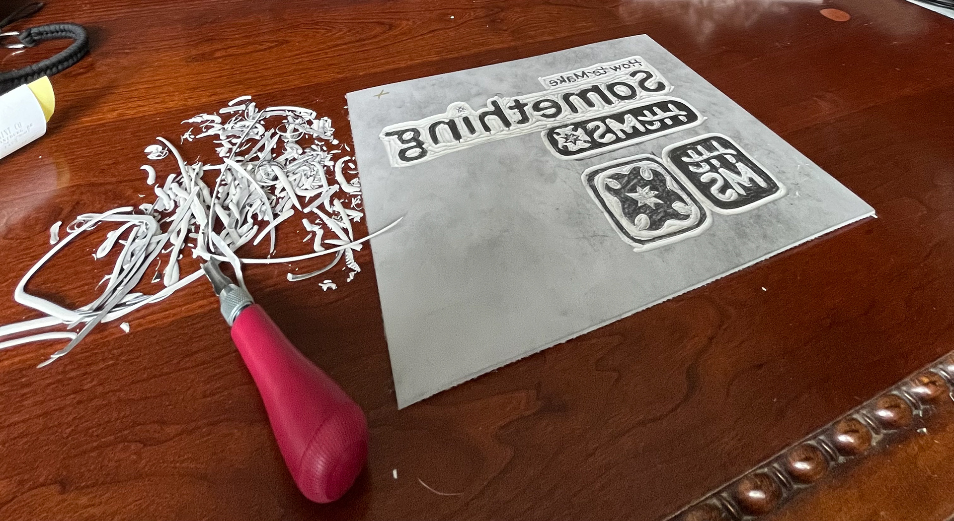
Chapter 5 of Strategic Creativity by Robin Landa discusses the importance of fully conceptualizing the meaning behind a brand’s visual identity to connect with the consumer. This chapter has made me reconsider the verbal and visual elements that I’ve established for How to Make Something. I realized that there is a very flat, sterile feeling to my logos perhaps because I took so much aesthetic influence from my web design created with what’s available on WordPress. If my research points to consumers who value honest expression and developing hobbies, my logo must change to better appeal to that audience. Because I spent a lot of time refining the logos for HtMS and didn’t want to scrap them altogether, I tried putting them into a new format. I carved out the wordmark, primary, and secondary logos in linoleum because I knew that the process would reflect not only the goals of HtMS but the preferences of my consumer as well. I will scan the stamps that I made so that they can be implemented into digital assets and physically applied to my handmade deliverables aka my zines. The imperfections and unique marks that now exist throughout my visual branding are very valuable to me as they emphasize the values of my brand.