Inquiry #5:
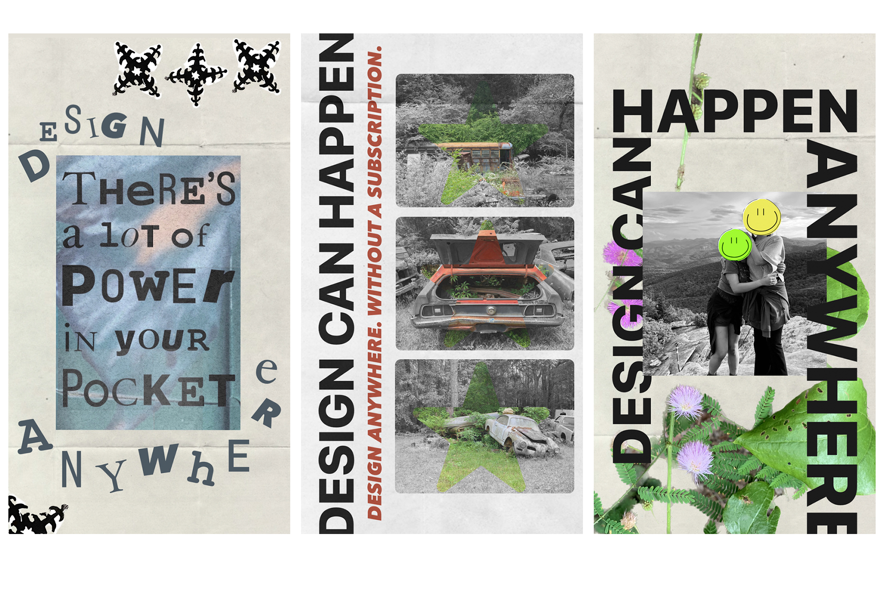
Inquiry #5 was the final week-long project for Process + Systems. As I was brainstorming ideas for what themes I wanted to design for this final inquiry, I also kept my plan for the final project in mind. For this inquiry, I wanted to focus on creating a project that looked at accessibility in design. Although there are many platforms on which designing is possible, many require a subscription, and if they don't, there is still the intimidation factor of "I don't belong in this space". So, I turned to the platforms and devices I interact with daily to see their capabilities even though they are not created with design in mind. For Inquiry #5, I set out to create a series of three posters created only using what was available on the Instagram mobile app. My goal was to demonstrate that anyone who is familiar with their phone and social media is capable of design. Through my research, I discovered that Instagram provides 9 typefaces, alignment, "bleed" boundaries, and the ability to bring in multiple photos. I screen-recorded my process of making each poster both to prove that the entirety of the design was made on Instagram and also to show people that this process is possible for them too. On the other hand, I found that non-destructive editing is practically impossible, the app is prone to crashing, and several other limitations. None of the limiting factors however stopped me from completing my designs. The posters say, "There is power in your pocket", "Design can happen anywhere" and "without a subscription" to speak to the idea that the interfaces that most people use every day are capable of much more than a distraction and that not having access to industry-standard programs shouldn't discourage someone from being able to create impactful designs.
Media #5:
Media #5 is podcast episode 95 from The Design Observer with Michael Bierut and Jessica Helfand. In this episode, they discuss a variety of topics from the minimalism wave in design and branding to some of the work of iconic designers. Within the conversation about the transition of intricate designs being replaced by sans serif and simplified wordmarks, Bierut said something along the lines of "brands looking for how to be part of the crowd but also how to stand out". This stuck out to me because this is something I notice about designs I see in the wild. How are brands like Chanel and Gucci able to differentiate themselves when their most simplified forms are black wordmarks on white backgrounds? I wonder if their reputations hadn't been established before having rebrands if they would have such a cult following because modern branding is so lacking to me. Yes, simple can be strong but if all these brands look similar on paper, what makes it worth spending $1000 on a belt? Another quote that stood out to me from this discussion is one that I've heard many times but especially after critique on Inquiry #5, hearing "form follows function" is a principle of design that feels extremely relevant. The posters I designed for inquiry #5 were informed by what I had handy in my camera roll and what Instagram would allow for. One comment that was made in the critique was that the overall compositions I created fit into current trends like the resurrection of Y2K. I wonder if I had designed under the same prompt but had allowed myself to sketch or use Adobe if they would have ended up at all similar.